

Target Audience
Core Audience: Indie fans of all age and gender

As we are an indie band, we thought that fans of indie genre was appropriate as the core audience. Age and gender doesn't really matter since people of all ages listen to indie music and attend indie festivals/gigs.
Secondary Audience: British 16-25 year olds all gender

Our band is based in the UK so targeting the British audience is fairly normal. We decided 16-25 year olds since that is the age range who listen to indie music most. Most people would start to listen to different music when they're around 16 years old and by the time they're 25 years old, they would have a wide range of music genres that they're into; this is why we're targeting this group.
Tertiary Audience: Music listeners

While making our three products we tried to pay as much attention to what the audience would gain from it, using the Uses and Gratification theory by Blumler and Katz. The Uses and Gratifications are: diversion, personal relationships, personal identity and surveillance.
Feedback from Surveymonkey:
Create your free online surveys with SurveyMonkey , the world's leading questionnaire tool.
(above is the survey we used for feedback)
Below is a video I made on the survey feedback we received:
We also interviewed 4 people of different ages about our music video for more detailed and personal responses:
For the music video, if I were able to go back in time and redo the whole production, these are the things I'd take into account:
- Have a different wide shot as well as the shot we had for more variation
- Possibly have the band members interact with the couple for more character of the band members
- Have a few more iconography in the sets for the eras for a recognisable set up.
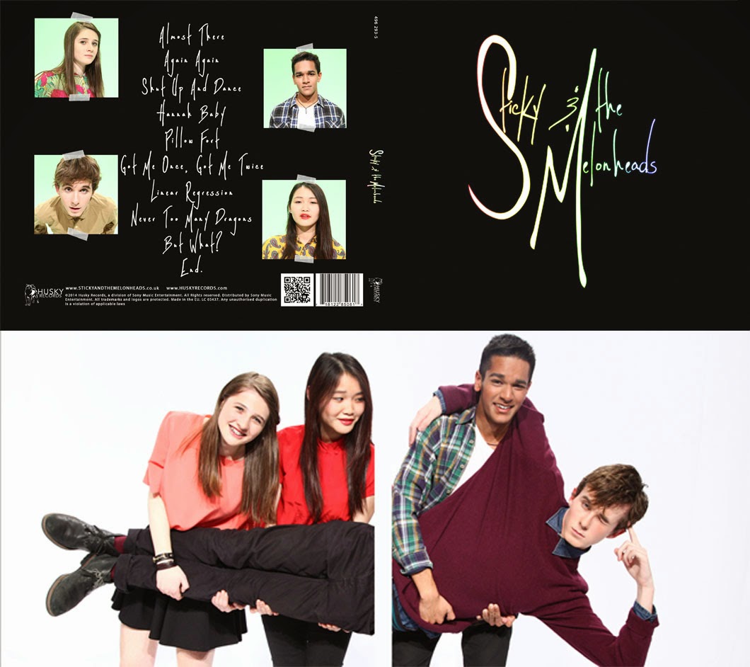
As well as feedback for our music video, we also received feedback on our album art and website:

I did not expect many people to like the sticky tape as they might think it is tacky although I did like it, but the feedback we got said otherwise. The band image was clearly shown through the upbeat and colour feel the website gives off.
As a website, it was able to comply with all the website conventions as the audience is able to navigate easily from page to page.
Some things that could be improved making it a better experience for the audience could be either removing the scrolling advert banner at the top, since that was picked up in our feedback, or we could possibly use less images to make the website not as 'busy'.
The feedback we received was quite mixed. They all tended to like the photo on the inside and the way the images of the band are stuck on using sticky tape as it is what indie fans do with their photos. However, there was a problem with the black background on the front of the cover, making the logo blend in and not as noticeable as the band seem to be. The audience was able to pick up on the use of sticky tapes between the website and the album cover, so they were able to link the two and recognise the band image. If I was able to redo the album cover, I would:
- Like the girl in the video suggested, I think we could make the rainbow colour on the logo more bold to make it stand out. If we did this, then it would possibly make the album cover more 'fun' even though the background is black.
- I do like the black however, since it is meant to draw the audience's attention to the logo itself, allowing them to recognise it. The black feature of our album cover was able to stimulate some nostalgia with our older audience
No comments:
Post a Comment