
Website

Album Digipak
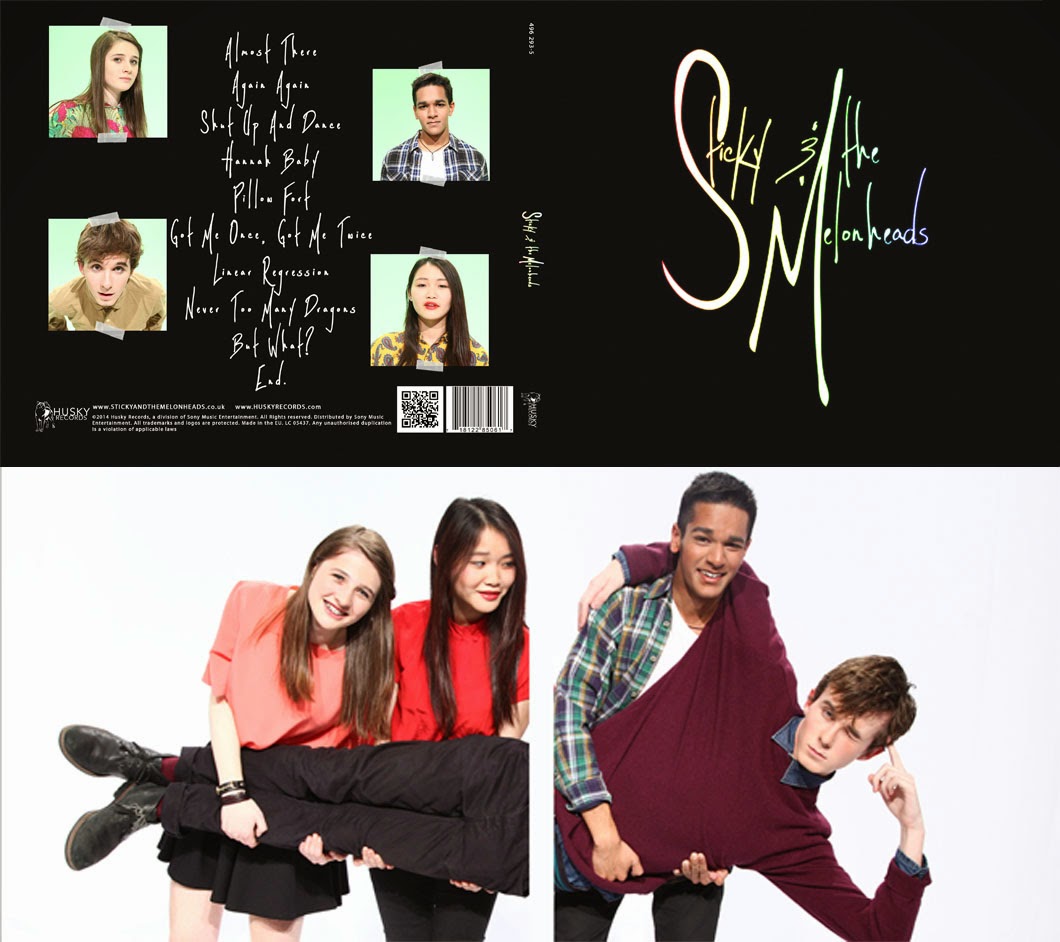
Album Digipak (Top Left: Back Cover, Top Right: Front Cover, Bottom Left: Inside Left, Bottom Right: Inside Right)
Monday 26 January 2015
Thursday 1 January 2015
1) In What Ways Do Your Media Products Use, Develop Or Challenge Forms And Conventions Of Real Media Products?
When we were creating our three products, we researched real media texts to understand the conventions and apply them to our own. We made sure to comply to certain conventions but went against some across our music video, album digipack and website.
We researched conventions of music videos in general as well as conventions of our genre: indie-pop. One convention of music videos are that they are usually based around performance, narrative or concept. For our music video, it's mainly performance based with some narrative to it, giving it some depth and allowing the audience to relate to it in some way.
Visually, we wanted the music video to look like a real one, so we researched what the conventions are. Some music videos we looked at the most are:
When looking for the conventions, we made sure to follow Andrew Goodwin's theory for music videos which stated that music videos demonstrate genre characteristics. If our music video had the genre conventions then it would be easily recognised by the genre fans, so they could enjoy it and relate to it.
Like the Awkward video, they started off with a close up of the guitar being played, which is quite conventional. Close ups also give a variation in shot types, keeping the audience engaged and making it more interesting.
These shots are also conventional of the indie genre. We needed shots of each member to establish what role they play and what their personalities are like. Also since we have a multiracial band, close ups of each band member would help reach a wider audience as more people can relate to the band and possibly aspire to be like the members.

As you can see our band consists of 2 females and 2 males, breaking the all-male indie band convention. Despite this, there are some that break that convention. For example, 'Paramore' and Florence and The Machine' both have females lead singers in their bands. However, we went against the genre stereotype that females sing over playing the instruments.
Also in our band, we have a variety of ethnic backgrounds, representing a large part of the British audience. This appeals to audience of different races as they can relate to the different band members. This is also a representation of Britain itself, as a multicultural society.
Below is a prezi I made explaining the intertexual references of our eras:
We got the idea of filling our music video with references from Iggy Azalea's 'Fancy' music video:
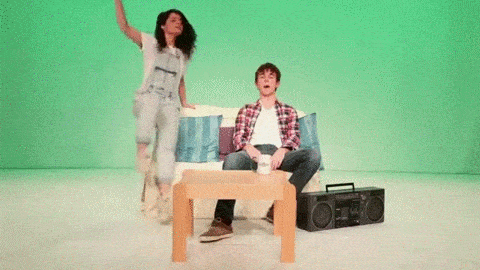
In the gif above, Juliette takes Jacob's hand and to express the lyrics clearly, Jacob directly addresses the camera with a confused look, showing he didn't know how it happened.
Music Video:
We researched conventions of music videos in general as well as conventions of our genre: indie-pop. One convention of music videos are that they are usually based around performance, narrative or concept. For our music video, it's mainly performance based with some narrative to it, giving it some depth and allowing the audience to relate to it in some way.
Visually, we wanted the music video to look like a real one, so we researched what the conventions are. Some music videos we looked at the most are:
Girls by The 1975
Awkward by San Cisco
Love Is On The Radio by McFly
When looking for the conventions, we made sure to follow Andrew Goodwin's theory for music videos which stated that music videos demonstrate genre characteristics. If our music video had the genre conventions then it would be easily recognised by the genre fans, so they could enjoy it and relate to it.
Genre Conventions:
Most indie-pop bands tend to have the ideal that their music videos have to be unique and different, leaving an impact on the audience. We wanted to conform to the general music video convention of the authentic band shots as the music videos we took inspiration had these shots included. For example:
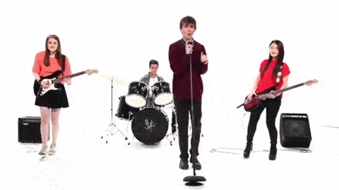
- Performance Shot(wide shot of band)
 |
| Left: The 1975 Right: Our Band |
This wide shot of the band is used to establish the roles of each member in the band, especially since our band is still just debuting. This allows the audience to become familiar with the band as well as their personalities shown through the performance. Also performance shots generally attract fans to want to see the artist perform live,therefore buying the tickets to see them live.
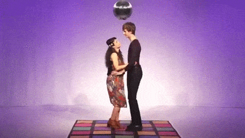
- Beauty/Money Shots
 |
| Fred Astaire - San Cisco |
 |
| Jacob - Our Music Video |
By using beauty shots, we are packaging the artist in an appealing way for the audience to consume. As Richard Dyer stated, an artist has to be packaged well and sold to the audience. Close ups are used to attract the audience as well; as Goodwin said, record labels need close ups to gratify the audience's expectations, which in our case are innocent but clear and direct. This gives an identity for the audience to become familiar with and hold on to.
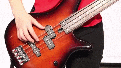
- Instrument Close Ups
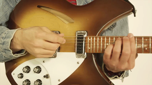 |
| Awkward - San Cisco |
 |
| Audrey playing guitar |
- As well as individual band shots
 |
| Top: Girls - The 1975 Bottom: Audrey in our MV |
Conventions We Challenged/Developed:
- Same Race Male Band
As you can see our band consists of 2 females and 2 males, breaking the all-male indie band convention. Despite this, there are some that break that convention. For example, 'Paramore' and Florence and The Machine' both have females lead singers in their bands. However, we went against the genre stereotype that females sing over playing the instruments.
Also in our band, we have a variety of ethnic backgrounds, representing a large part of the British audience. This appeals to audience of different races as they can relate to the different band members. This is also a representation of Britain itself, as a multicultural society.
Intertexual References
Intertexuality is a significant theme in our music video, since we have a lot of references in it. Most of our music video consists of our narrative scenes which are told in different eras. For the audience to understand the references we've made in the different eras, we had to pick out well-known iconography.Below is a prezi I made explaining the intertexual references of our eras:
Having so many specific references would make the audience want to watch it over and over, in order to understand them all. Once they have understood the references they could share and discuss it with their friends, gratifying their entertainment and social interactions, while exploiting the artist. We made sure that the references we used would be recognised by our audience aged 16-25 years old, however these references are iconic so a wider demographic may understand too. Without the references, the audience wouldn't understand the meaning of our music video; love is the same no matter what era.
We got the idea of filling our music video with references from Iggy Azalea's 'Fancy' music video:
 |
| Left: Clueless Screenshot Right: Iggy Azalea's 'Fancy' Screenshot |
Her video references the popular film 'Clueless', as pictured above. This appeals to her audience of 16-25 year olds, as they would understand the references. The link between the song and the film attracts a wider audience who, if they enjoy both the film and the song, will like the music video and could trigger some nostalgia of the film.
Relationship between Lyric and Visual
As Andrew Goodwin's theory on music videos imply, there should be some sort of relationship between the lyrics and the visuals. Here are some examples we took inspiration from:
 |
| Lyrics: 'But she can't be what you need if she's 17' |
In The 1975's music video for 'Girls', a girl blows her '17th birthday cake' at the time that lyrics end.
 |
| Lyrics: 'Stick figures silicon barbie doll' |
In Meghan Trainor's music video for 'All About The Bass', they act out stick figurines for that line, emphasising the falseness of the stick figurines.
From these examples, we made our own lyric-visual links in our music video:
 |
| Lyrics: 'She took my arm, I don't know how it happened' |
Editing
Carol Vernallis states that editing may match the music phrases or the beat. For our music video, we conform to her theory and cut to the beat for all the narrative scenes. However to have some variety, during the band scenes, we use fast-paced editing, breaking the convention.
We also use match-on-actions for the narrative scenes as we thought it was appropriate to tell a story, breaking another convention of music videos. Though for the performance scenes, we did not worry about match-on-actions as it wouldn't be breaking continuity of the sequence.
Album Digipak:
Website:
2) How Effective Is The Combination Of Your Main Product And Ancillary Texts?
I feel that we were able to effectively combine our main product and ancillary texts, especially through our easily identifiable brand identity created by our constant recurring themes used across all the texts. As Richard Dyer said, an artist is a product of a record company and needs to be packaged and sold to audience, to do this we must have their band image consistent throughout all the texts. Our website, music video and album cover all have a clear link with the strong sense of brand and band identity which creates a synergistic and an effective cross-platform marketing campaign.

 The band image is conveyed through each members actions and costume. They move to the music and their facial expressions show their friendly and fun side as well as showing their passion for music since they're enjoying it too.

In the different eras, we use bright colours to portray our bands light-hearted and fun image as an indie-pop band.

Album Art:

Website:
Keeping the band image consistent through all the texts makes sure it creates a synergistic campaign. So overall, I think our campaign was fairly effective as our band image was able to be portrayed in all forms of text. However for our music video, we could have improved it by linking it to our album or website. Possibly including 'Out now' or maybe our band logo which is what 'The 1975' does at the beginning of all their music videos.
Band Image:
The band image is one of the most important things to establish in a campaign for the audience to recognise them and relate to them. Below is a world cloud of traits our 'pop star' has:
Without band image set, we made sure to express that throughout all our texts:
Music Video:
The band image is conveyed through each members actions and costume. They move to the music and their facial expressions show their friendly and fun side as well as showing their passion for music since they're enjoying it too.In the different eras, we use bright colours to portray our bands light-hearted and fun image as an indie-pop band.
Album Art:
Website:
We used The 1975's marketing campaign as an example:
 |
| The 1975's logo fading in |
Keeping the band image consistent through all the texts makes sure it creates a synergistic campaign. So overall, I think our campaign was fairly effective as our band image was able to be portrayed in all forms of text. However for our music video, we could have improved it by linking it to our album or website. Possibly including 'Out now' or maybe our band logo which is what 'The 1975' does at the beginning of all their music videos.
3) What Have You Learned From Your Audience Feedback?
To get the feedback we wanted, we used Surveymonkey and shared it via our social networking sites, so random people will be able to respond to it, giving us a range of answers to work with. We also interviewed people on our products and asked peers to give us feedback during our construction stage.


While making our three products we tried to pay as much attention to what the audience would gain from it, using the Uses and Gratification theory by Blumler and Katz. The Uses and Gratifications are: diversion, personal relationships, personal identity and surveillance.
Feedback from Surveymonkey:

The feedback we received was quite mixed. They all tended to like the photo on the inside and the way the images of the band are stuck on using sticky tape as it is what indie fans do with their photos. However, there was a problem with the black background on the front of the cover, making the logo blend in and not as noticeable as the band seem to be. The audience was able to pick up on the use of sticky tapes between the website and the album cover, so they were able to link the two and recognise the band image. If I was able to redo the album cover, I would:
Target Audience
Core Audience: Indie fans of all age and gender
As we are an indie band, we thought that fans of indie genre was appropriate as the core audience. Age and gender doesn't really matter since people of all ages listen to indie music and attend indie festivals/gigs.
Secondary Audience: British 16-25 year olds all gender
Our band is based in the UK so targeting the British audience is fairly normal. We decided 16-25 year olds since that is the age range who listen to indie music most. Most people would start to listen to different music when they're around 16 years old and by the time they're 25 years old, they would have a wide range of music genres that they're into; this is why we're targeting this group.
Tertiary Audience: Music listeners
While making our three products we tried to pay as much attention to what the audience would gain from it, using the Uses and Gratification theory by Blumler and Katz. The Uses and Gratifications are: diversion, personal relationships, personal identity and surveillance.
Feedback from Surveymonkey:
Create your free online surveys with SurveyMonkey , the world's leading questionnaire tool.
(above is the survey we used for feedback)
Below is a video I made on the survey feedback we received:
We also interviewed 4 people of different ages about our music video for more detailed and personal responses:
For the music video, if I were able to go back in time and redo the whole production, these are the things I'd take into account:
- Have a different wide shot as well as the shot we had for more variation
- Possibly have the band members interact with the couple for more character of the band members
- Have a few more iconography in the sets for the eras for a recognisable set up.
As well as feedback for our music video, we also received feedback on our album art and website:
I did not expect many people to like the sticky tape as they might think it is tacky although I did like it, but the feedback we got said otherwise. The band image was clearly shown through the upbeat and colour feel the website gives off.
As a website, it was able to comply with all the website conventions as the audience is able to navigate easily from page to page.
Some things that could be improved making it a better experience for the audience could be either removing the scrolling advert banner at the top, since that was picked up in our feedback, or we could possibly use less images to make the website not as 'busy'.
The feedback we received was quite mixed. They all tended to like the photo on the inside and the way the images of the band are stuck on using sticky tape as it is what indie fans do with their photos. However, there was a problem with the black background on the front of the cover, making the logo blend in and not as noticeable as the band seem to be. The audience was able to pick up on the use of sticky tapes between the website and the album cover, so they were able to link the two and recognise the band image. If I was able to redo the album cover, I would:
- Like the girl in the video suggested, I think we could make the rainbow colour on the logo more bold to make it stand out. If we did this, then it would possibly make the album cover more 'fun' even though the background is black.
- I do like the black however, since it is meant to draw the audience's attention to the logo itself, allowing them to recognise it. The black feature of our album cover was able to stimulate some nostalgia with our older audience
4) How Did You Use New Media Technologies In The Construction And Research, Planning and Evaluation Stages?
We used a range of technologies throughout all the stages of making our music video, including sites like Facebook and Pintrest to hardware and softwares like cameras and Adobe Photoshop.
When the project started we made a Facebook group, which included all four of our members. This became really handy as we were able to send multimedia message to each other instantly and receive replies without haven't to wait until the next production meeting.
When we were researching era references, we made a YouTube playlist of the videos we thought were useful. This meant that anyone was able to access it at any time. From these videos, we took inspiration for our choreography.
We also used Pinterest to gather useful images for references of each era and for our band image. This was very helpful as we could see a handful of images for a certain era which we used to determine a final costume for each era.


Mobile phones now are all technologically converged, meaning we were able to use it in more ways than just messaging each other, which we obviously took advantage of.
We also used our phones as cameras to take pictures and videos of our process which we were able to post straight onto Facebook on our smart phones due to the proliferation of technology,
Since we were able to use our phones as cameras, it helped us greatly during the filming. For example, for the 90s scene, we had the cushions and the sofa set out exactly how it should be but after every take, we would have to re-adjust the sofa to how it was before, keeping the continuity. At this point, we would refer back to the photo we took of the set.


To make gifs, I used Adobe Photoshop. I preferred to use this software over websites like 'Imgflip' and 'gifmaker' since it didn't produce a gif with a watermark and the result becomes much clearer and cleaner. However the downside of this method was that it was quite time consuming. Also since I did not own Photoshop at home, I had to make the gifs at school.
However in desperate times, when I'm not at school, I would have to use 'Gifyoutube' to make gifs. The only problem with using this was the gifs that were created, was slightly sped up. Also it was harder to select the sections I wanted to include in the gif, whereas on Adobe Photoshop, I was able to look through frame by frame.
Another software I used from Adobe was Premiere Pro. I used this to make a short video of me narrating the analysis of our survey feedback. I used the skills I learnt from creating the dance sequence to be able to scale the images I imported and move the position of them so it fit nicely.
Research and Planning
Web 2.0
With the proliferation of technology, we were able to use Web 2.0 to help us communicate instantly throughout our project. |
 |
| Juliette sending photos for costume and props |
 |
| Writing feedback for people who were absent |
 |
| Youtube Playlist |
 |
Mobile Phones
Mobile phones now are all technologically converged, meaning we were able to use it in more ways than just messaging each other, which we obviously took advantage of.
We also used our phones as cameras to take pictures and videos of our process which we were able to post straight onto Facebook on our smart phones due to the proliferation of technology,
Since we were able to use our phones as cameras, it helped us greatly during the filming. For example, for the 90s scene, we had the cushions and the sofa set out exactly how it should be but after every take, we would have to re-adjust the sofa to how it was before, keeping the continuity. At this point, we would refer back to the photo we took of the set.
Construction
Album Cover
Photoshop
I had used Photoshop before, so it was quite easy to understand how to use the basic tools. This was a really useful software since we could put everything into layers which makes it easier to move around and manipulate. Whenever we tried out a new design for our album cover we were able to simply group all the layers and duplicate it onto a new file. We also used Photoshop to edit our promotional photos, getting rid of the background junk and slight imperfections using the heal tool, as well as for our banners at the top of our website.
Website
Web 2.0: Wix
Wix was a website I had never come across before, so I was really confused about how to use it. However after a while I was able to get used to it and it became really handy with such simple tools. One thing I liked about using wix was how easy it was to move things to where you wanted it. For example, if you wanted to move something so it would be at the top of every page, all you had to do was drag the image so it would be in the header section. I thought that feature would cause restrictions - however if you wanted an image to be in the body but it had to cross the header boundary, you could still do it.
 |
| The 2 images that crossed the header line are still in the body and not on every page |
Evaluation
 |
| Screenshot from Surveymonkey |
Surveymonkey was extremely useful since we were able to share our video and get feedback from anonymous people who can share their honest opinion with us without being biased. We were also able to look at the results overall and analyse them. It was easy to analyse most of the results since Surveymonkey automatically puts the gathered results into graphs unless it's written answers.
To make gifs, I used Adobe Photoshop. I preferred to use this software over websites like 'Imgflip' and 'gifmaker' since it didn't produce a gif with a watermark and the result becomes much clearer and cleaner. However the downside of this method was that it was quite time consuming. Also since I did not own Photoshop at home, I had to make the gifs at school.
However in desperate times, when I'm not at school, I would have to use 'Gifyoutube' to make gifs. The only problem with using this was the gifs that were created, was slightly sped up. Also it was harder to select the sections I wanted to include in the gif, whereas on Adobe Photoshop, I was able to look through frame by frame.
 |
| Made with Adobe Photoshop |
 |
| Made with Gifyoutube |
 |
| Adobe Premiere Pro |

Subscribe to:
Posts (Atom)