Welcome


Welcome to my A2 media coursework blog, my name is Chrystal Li (0470) and I will be working in Group 3 along with Audrey King Lassman (0397), Juliette Wileman (0875) and Brandon Poonwasie (0660).

On the right-hand side of my blog, there are labels which you can use to navigate yourself around my blog.


Thank you


Here is a live link to our group facebook page.

Website

Group 3 Music Video

Album Digipak

Album Digipak
Album Digipak (Top Left: Back Cover, Top Right: Front Cover, Bottom Left: Inside Left, Bottom Right: Inside Right)

Friday 19 December 2014

Editing: Dance Editing and Cutting Between Eras

After getting feedback from Ms Dymioti, we were told that the second dance sequence was not as effective as the first one as the editing style is the same making it boring and predictable. So we tried out a few different things on the dance sequence.


First we tried with split bodies, however as you can see in the video above, it did not turn out as well as we anticipated. Due to their body movements not being at the same point in each era, although it did work for some clips we were not able to make it look aesthetically pleasing for the other eras.


We then tried doing split screens, this worked much better with the dance sequence than it did with the split bodies. However the problem with this was the size decrease as it reduced the impact of the dance, since it wasn't as visible.

But in the end we came up with this final idea:


In our final cut for the second dance sequence, we had split screens however instead of having 4 split screens, we decided to have only at most 3 on the screen so the audience can still focus on the couple. Luckily all the background colours compliment each other making it still nice to watch.

Cutting Between Eras


Seeing that our music video didn't have many interesting editing, we decided to try out our initial idea of cutting between the eras on the beat of the music. In the end we decided on this idea as it was able to help change the pace of the era transitions, also it was a different type of editing, giving our music video some variety.

Website: About Pages

On our website, for the fans to have more interactivity with the band, we made about pages for information of the band members and the band itself.

About main page
If you click on each of the pictures, it would link you to the about page of each member, underneath we wrote a little paragraph of how our band got together, we took inspiration from bands like San Cisco.

However for them, they did a very simplistic explanation whereas we wanted the fans to know the band more as they're still a new band.

For the individual band member profiles, we had them answer questions to let the fans know more and feel relatable to the members:


After showing our teacher our music video, she thought it would be nice to have some background on our actress, Juliette, on the website aswell.


So in the same style as the other about pages, we decided to do the same for our actress 'Jess'. This about page is also quite important as she plays a big part in our music video and blooper reel, so making an about page seems appropriate allowing the fans to get to know the actress better and her relationship with the band.

Throughout these pages we still kept the consistent sitcky tapes on the images and the colours of our band logo, keeping a constant band image throughout the website.

Website: Interactivity

Interactivity is important to keep the audience consuming your product. The website has information which the audience would want to know however to capture their attention having increased interactivity will help.

Some ways we increased the interactivity:


  • Interactive Banner


At the top of the website we included an interactive banner, as shown in the slideshow above. When on any page of our website, you would be able to see this scrolling banner, which, if clicked, would link you to any of the pages that are related. Making an easier navigation for the audience and we could easily attract their attention to certain aspects like the music video.


  • News Feed

Scrolling News Feed
A scrolling news feed which is on the home page linked to all three social networks: Facebook, Twitter and Instagram. Through this, the audience can see what the band is up to. It can also be used to promote events. While this links to the bands social networks, we also have links that go directly to the pages:

The Apple logo links to the itunes page where the fans can instantly buy the album/single


  • Competition

We have given the opportunity for fans to win a signed album copy, front row tickets and get to spend a day with the band. This would be fun for the fans to make and they would be able to interact with the band. They enter by uploading a video onto sites like YouTube and send it to the fans via Twitter. We made it so its a video of 'you and a friend' to get more people involved, raising the awareness of the band. Inspired by Mcfly, getting their fans to send in videos of them singing to their single 'Love is on the Radio'

  • Message the band/Sign Up

Since not everyone would want to sign up for updates, we made a 'contact us' form so people could still message the band, allowing them to still feel connected.


Audience Feedback

When we had finished editing our music video we asked 6 people from our core audience of 16-25 year olds for feedback:

From these responses we were able to see what we should definitely keep and what we had to improve on. This person noticed the jarring movements in the band scenes and with that we corrected it making it better.


Most of our audiences were able to understand the theme of the music video and what the bands personality is. This is positive feedback as we now know that the message we were trying to convey in our music video was able to reach the audience.

Here are a some more feedback:


So overall I am really proud of the outcome but if I was given the chance to improve on it, I would preferably change the background colour for 80s since everything in that scene is overflowing with yellow. However I think that the whole process of making this music video did have some ups and downs which I was able to learn from for example the timings during shoots which we improved on very quickly, in the end we made a product i was proud of.

Album Digipak

From our flat plan design we created our first album digipak:


As I said before, we wanted a minimalistic design. On the outside it would be plain and cool, but on the inside it would show the band's quirkiness. We wanted the contrast between the white and lighthearted inside to the black and cool outside.

However after receiving feedback from our teacher we realised that the back cover of the digipak was not good enough. We used The 1975 as a reference however they had 2 colomns of track list, making it look less plain.

So we tried different things to make it look better:


Gallery Style

We thought about doing it like our website gallery, which we did like but we wouldn't get the impact of the contrast between the inside and outside of the album digipak.

Trying to keep our band image constant from the website to the album, we tried the rainbow colours border with the sticky tapes, which look aesthetically pleasing but still lacked something.

In the end we were finally able to settle on one design:


This had small images of the band members but not too big that it was overwhelming, just the right size. Since they were smell we would still get the contrast. The poses of the members were all 'calm and cool' which contrasted with the image on the inside...

...revealing their quirky personalities.

Editing: Grading

To edit our music video, we also needed to grade it. To do this, we used the following on Adobe Premier Pro:
  • Procamp- changing the brightness, contrast and saturation of the clip
  • Three Wheel Colour Correction- making the clip have a more natural skin tone
  • Change Colour- change one whole colour to another on the clip

Since I wasn't that experienced in using the three features, it took me longer to grade shot. Which I then had to made sure was alright with the rest of the group.

We also had to use Adobe After Effects:


We used After Effects for the 80s scene since it was too hard to grade on Premiere Pro. We used the Colour Finesse 3 to change the colours so the skin colours doesn't look unnatural and would not blend into the background. I had never used this program before, so I felt insecure using it. In order not to mess up, I did not partake in grading using After Effects.

Website: Tour Dates and Merchandise

Being able to play live is a crucial part of interacting with fans for a band, especially for a debuting band, the fans would be curious of what they are live and it would allow them to feel closer to the band. After going to a gig, people would tend to talk about it spreading the word of our debuting band.

For fans to get the chance to go see the band live, we put the tour dates information on the website, there would be buttons which would link straight to Ticketmaster for the fans to buy the tickets instantly.


For the tour dates, Juliette and I made sure it was after the release of the bands first album. Since the band is an upcoming indie band, not many places would accept the band for perform at their stages, so we chose indie specific places. For example The Roundhouse in Camden tends to have lots of indie bands perform there like 'Gorgon City' and 'Kodaline'; we decided that the band would be able to perform there for at least 2 nights, then for the other places only one night.


As for the merchandise, we noticed after researching that most artists tend to have a merchandise section on their website, which we thought was appropriate for our website too:

Clothing from our store
Accessories
We chose to have this design for our merchandise since it promotes the band but still looks 'cool' due to the all black. We decided not to have any other colours but black to keep it gender neutral and a universal colour, since our target audience is for anyone that's into indie music.

Website: Blooper Reel


While editing our music video, we saw the many outtakes we obtained from our shoots and decided to create a blooper reel. We thought this was a good idea as the audience would feel more involved with the band and see what the bands really like behind the scene; thus making a more personal link to the fans.

The blooper reel is on our website which can be easily accessed through the gallery:

Leading you to:
Our blooper reel page

Saturday 13 December 2014

Website: Design

As a group we had decided that our band logo would be:

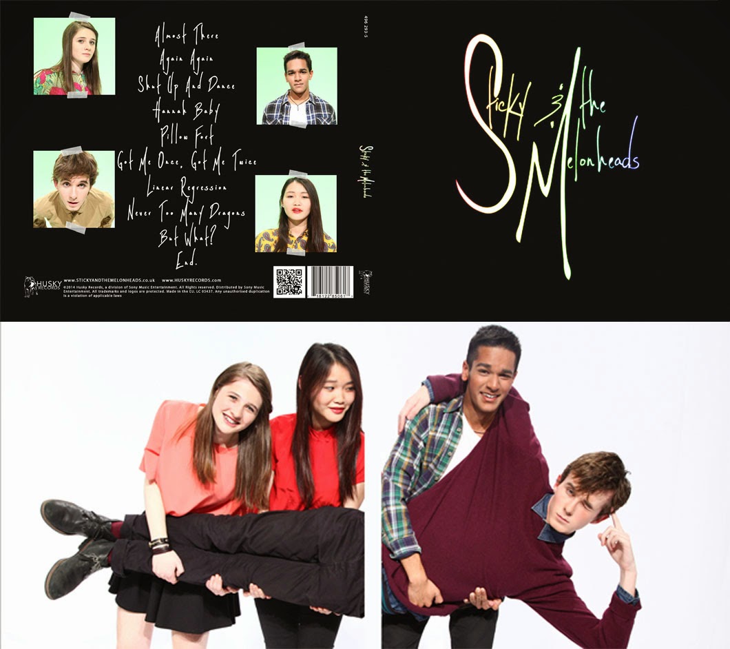
Therefore to make everything link to each other, that would be our album cover for the bands debut as well as used on our website. This maintains the bands image consistent throughout the campaign of the album and keep the a synergistic promotional strategy.

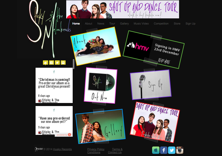
This is our old homepage:
Old Home Page
Since our band is called Sticky & The Melonheads, we decided to incorporate the 'sticky' in our theme aswell using the sticky tape design. This is consistent between our website and album cover.

This feature is used throughout all the pages on our website, not only the home page:

We even used the colours that are tinted on our logo as the borders on our website, giving the website some contrast between the black background and the images.

Since having the same design on every page will be boring, we decided to add some variation in our gallery. We used the 'accordian' design as a gallery and when scrolled over, the gallery will open up on the image which is hovered over, also when you click on the image it opens up.


The variation of display for the gallery provides an interesting and different way to interact with the website, engaging the audience.

After reviewing our blog with peers, we found a problem with our homepage. Though we loved it aesthetically, it did not have any information that the audience can see straight away when they went on our website. Being able to gain information easily and quickly is the whole point of an artist's website. 

We liked the layout of it, so we kept it fairly similar. Since the text says what the image links too is too small, we decided to have them be written on the image itself, so it's not strenuous to see what the text says. For the text on the images, we kept the same font as the logo, keeping a consistent image throughout the website. After that change, we still thought that the homepage was lacking information. 
We then found a live social media feed, which allows the audience to see what the band are up to directly from the website. This is an instant way for people to connect with the band even if they didn't have social media. It is an immediate way of promoting the band aswell. 
After adding all the changes, there was still some gap that needed to be filled so we decided to directly promote our album by having the 'Out Now' on an image of the CD, which links to the store, and a sign up image which links to the sign up page.


Below is the result of all the changes we had made:
New Homepage